[This is a revised version of this earlier blog post about a previous draft of the same paper]
Why would you ask your employer not to pay you yet? This is something I would personally never do. If I don’t want to spend money yet, I can just keep it in a bank account. But it’s a fairly common request in developing countries: my own field staff have asked this of me several times, and dairy farmers in Kenya will actually accept lower pay in order to put off getting paid.
There is in fact a straightforward logic to wanting to get paid later. In developed economies, savings earns a positive return, but in much of the developing world, people face a negative effective interest rate on their savings. Banks are loaded with transaction costs and hidden fees, and money hidden elsewhere could be stolen or lost. So deferred wages can be a very attractive way to save money until you actually want to spend it.
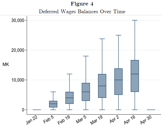
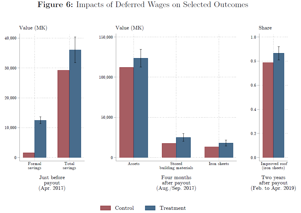
Lasse Brune, Eric Chyn, and I have a paper now forthcoming in the American Economic Review that takes that idea and turns it into a practical savings product for employees of a tea company in Malawi. (The ungated pre-print is available here.) Workers could choose to sign up and have a fraction of their pay withheld each payday, to be paid out in a lump sum at the end of the three-month harvest season. About half of workers chose to sign up for the product; this choice was actually implemented at random for half of the workers who signed up. Workers who signed up saved 14% of their income in the scheme and increased their net savings by 23%.
The savings product has lasting effects on wealth. Workers spent a large fraction of their savings on durable goods, especially goods used for home improvements. Four months after the scheme ended, they owned 10% more assets overall, and 34% more of the iron sheeting used to improve roofs. We then let treatment-group workers participate in the savings product two more times, and followed up nine months after the lump sum payout for the last round. Treatment-group workers ended up 10% more likely to have improved metal roofs on their homes.*
This “Pay Me Later” product was unusually popular and successful for a savings intervention, which typically have low takeup and utilization and rarely have downstream effects.** What made this product work so well? We ran a set of additional choice experiments to figure out which features drove the high demand for this form of savings.
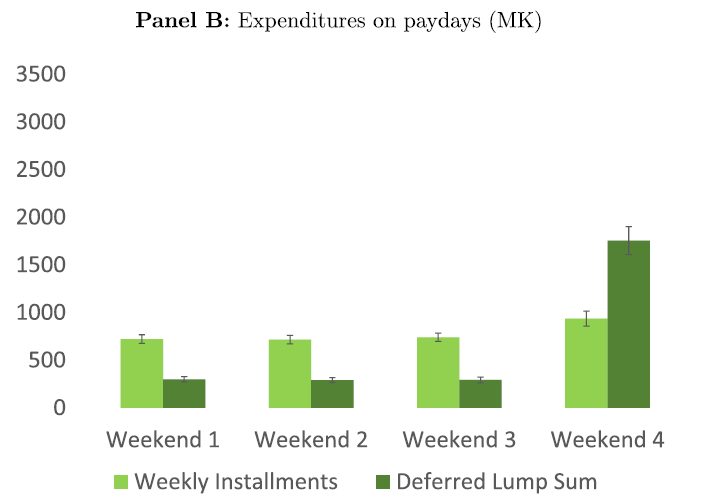
The first key feature is paying out the savings in a lump sum. When we offered a version of the scheme that paid out the savings smoothly (in six weekly installments after the end of the season), takeup fell by 35%. The second is the automatic “deposits” that are built into the design. We offered some workers an identical product that differed only in that deposits were manual: a project staffer was located adjacent to the payroll site to accept deposits. Signup for this manual-deposits version matched the original scheme but actual utilization was much lower. Heterogeneous treatment effects tests suggest that automatic deposits are beneficial in part because they help workers overcome self-control problems.
On the other hand, the seasonal timing of the product was much less important for driving demand: it was just about as popular during the offseason as the main harvest season. Relaxing the commitment savings aspect of the product also doesn’t matter much. When we offered a version of the product where workers could access the funds at any time during the season, it was just as popular as the original version where the funds were locked away.
In summary, letting people opt in to get paid later is a very promising way to help them save money. It can be run at nearly zero marginal cost, once the payroll system is designed to accommodate it and people are signed up. The benefits are substantial: it’s very popular and leads to meaningful increases in wealth. It could potentially be deployed not just by firms but also by governments running cash transfer programs and workfare schemes.
The success of “Pay Me Later” highlights the importance of paying attention to the solutions people in developing countries are already finding to the malfunctioning markets hindering their lives. Eric, Lasse, and I did a lot of work to design the experiment, and our field team (particularly Ndema Longwe and Rachel Sander) and the management at the Lujeri Tea Estate deserve credit for making the research and the project work.*** But a lot of credit also should go to the workers who asked us not to pay them yet—this is their idea, and it worked extremely well.