Choosing the facts you want to hear

Michael Shermer wrote a piece for Scientific American about the broad statistics on gun violence, and how they shaped his decision to give up his personal firearm. The top comment by Jim Pennington is indicative of an awful pattern in modern American political life: people opt out of news sources that report information that they disagree with.

In any case, since Scientific American (I’ve been a subscriber for over 10 years) has decided to get political, then I choose to do the same. Therefore I will NOT be renewing my subscription when it comes due nor will I waste my time reading the issues I still have coming. I also will mention to my acquaintenances that your magazine has become left wing publication just as U.S News and World Report did. You know what happened to them.

The way I see it, this is a pernicious attitude that is independent of whether you agree with Shermer’s opinion or even whether you think the statistics he cited tell the whole story. This isn’t a legitimate complaint about scientific accuracy. Pennington says “Why does this idiot Shermer think that anyone who hasn’t had formal training in firearms is any less competent to use one than someone who has?”, rhetorically suggesting that it is obvious that firearms training is worthless. I strongly doubt he actually believes that. Rather, this is an emotional response against Shermer’s opinion that has led Pennington to reject not only the data from the piece but anything that comes from it in the future.

I don’t think the desire to pick one’s information sources or facts is new, but the ability to pull it off is a fairly novel development. That means we’re seeing more polarization not just of attitudes and political tenets but actual beliefs about objective reality. This process undermines not only sound policy but science itself, which is bad news no matter what you think about gun control.

A simple observation about inflation and exchange rates in Malawi

Shortly after taking office last year, President Joyce Banda gave up on the Malawian Kwacha’s fixed peg against the dollar. Since then the exchange rate has evidently been some kind of managed float, meaning the rates are set in international markets. The unchallenged conventional wisdom is that this has drastically increased inflation in the country.* This piece in the Nyasa Times is a great example – it mentions, in passing, that “Soaring food and fuel prices have been stoking inflation since President Joyce Banda eased the kwacha’s peg against the dollar and devalued the currency by 49 percent.” Even people who support the reforms tend to concede that they have come at a large cost.

The issue is that there’s basically no way this claim is true. To oversimplify a good deal, Malawi is an agrarian society with a CPI basket (used to compute inflation rates) dominated by food. Imports are a pretty trivial share of food consumption, but food price inflation has been running at nearly the same rate as the overall rate. How can costlier imports (that is, a devalued Kwacha) be leading to price rises, when most of the rise in prices is non-imported food? The answer is they almost certainly cannot.

In case that didn’t convince you, here are some basic calculations. Malawi’s GDP was $14.265 billion in 2012, and about 30% of that was agriculture. That means the value of domestic agricultural production was $4.280 billion. Summing up all the food categories on indexMundi’s import breakdown for the country for 2011, I get $0.311 billion, meaning imports were 7% of all food; non-imported food was $3.968 billion. Food prices rose by ~30% year-on-year in February 2013 according to Malawi’s NSO. The exchange rate change is just a one-off rise in the price of imports. That was a drop of 49%, so we have 4.280*1.3=0.311*1.49 + 3.968*i, where i is the non-import (domestic) inflation rate. Solving for i gives us a blistering domestic inflation rate of 29% – imports are barely a drop in the ocean. What if we use the entire 142% decline in the exchange rate against the dollar since Banda took office? We still get a domestic inflation rate of 21%

Now, there are models in which the exchange rate might pass through to the broader economy and raise domestic inflation, but even a sophisticated approach would have to confront the basic fact that most Malawians are farmers who eat very little that is imported. And this is leaving aside the fact that when the currency peg was in place, a substantial share of imports were bought using black-market forex, and my skepticism that the basic inflation numbers are even correct. If we take the data at face value, it is pretty hard to justify the claim that the devaluation of the Kwacha is responsible for Malawi’s high inflation.

*I’ve written about the exchange rate peg and general misunderstandings of how foreign exchange markets work before; complaints about the Kwacha’s devaluation, far from being a Malawi-specific phenomenon, are representative of broadly-common misconceptions. I also have my doubts about the official inflation numbers (around 30% per year), which look way too high given my experiences buying staple goods in Malawi.

How to pronounce "Stata"

From the Statalist FAQ (emphasis mine):

4.1 What is the correct way to pronounce ‘Stata’?

Stata is an invented word. Some pronounce it with a long a as in day (Stay-ta); some pronounce it with a short a as in flat (Sta-ta); and some pronounce it with a long a as in ah (Stah-ta). The correct English pronunciation must remain a mystery, except that personnel of StataCorp use the first of these. Some other languages have stricter rules on pronunciation that will determine this issue for speakers of those languages. (Mata rhymes with Stata, naturally.)

This of course means that there is a right answer, but that StataCorp doesn’t want to take sides because they might piss people off. People are amazingly passionate about how they say the rarely-spoken names of software and other technical terms. If you want to start a fistfight, ask a group of nerds how to pronounce the name of the document markup language “LaTeX” or the image format “GIF”.

EDIT: Nick Cox, who wrote the Statalist FAQ, provided the following corrective in the comments:

Not so; or not really so. I wrote that originally, tongue in cheek, without any prompting whatsoever from the company and I don’t think it appears on any documents that don’t have my name on them, and I am not a StataCorp employee. Naturally, it remains true that the company would not knowingly host on any of their websites statements that they thought inappropriate. But the main interpretation is not that the company don’t want to take sides — there is only one pronunciation used at StataCorp — but that they have a sense of humour about something that isn’t really very important, namely how users and others pronounce the name. Now the correct spelling of Stata: that really is a big deal.

So the correct answer really is that there is no right answer. I am leaving my original post up for posterity, and because of my irrational passion in favor of the “Stay-ta” pronunciation.

An important negative result: teaching people about financial aid doesn't raise college attendance

As an economist and also somebody who loves facts, I never stop beating the drum of sticker prices vs. purchase prices in higher education. Long story short, the dizzying rise in sticker prices (the headline numbers decried by the news media) is mitigated and maybe even reversed when we look at the net price (after accounting for grants and scholarships).   Over the past 5 years or so, the former has risen sharply while the latter is basically flat across all schools and declining for private universities. People, even very smart people, almost uniformly ignore net prices when discussing what the rising cost of education means, and especially when talking about its effect on the poor. This is backwards: lots of programs target low-income students in particular

Since smart people with opinions on education policy don’t pay attention to net prices, it’s not surprising that most Americans aren’t aware of their financial aid options. This suggests an obvious policy change: we should inform people of how much financial aid they are eligible to receive. If we do so, the reasoning goes, more of them will go to college, especially on the low end of the scale. Yesterday I saw a talk by Eric Bettinger on the latest results from an experiment designed to test such a policy. Bettinger and coauthors Bridget Terry Long, Philip Oreopoulos, and Lisa Sanbonmatsu convinced with H&R Block to offer a group of their tax services clients either a) information about their financial aid eligibility or b) the same information, along with assistance in completing the FAFSA, which is required for almost all financial aid. At the baseline, the typical person overestimated the net cost of college attendance by a factor of 3.

Option b worked like gangbusters: recipients of the FAFSA assistance were 8 percentage points more likely to attend college, and the effect remains detectable well into their college years. Option a – just information about financial aid eligibility, did precisely nothing. And I do mean precise: Bettinger walked through some of the most impressive zeroes I’ve ever seen in a seminar. In general, Bettinger et al. can rule out effects much bigger than 2 percentage points (with -2 percentage points being about equally likely). During the seminar, Bettinger and Michigan’s own Sue Dynarski mentioned the fact that studies testing other ways of communicating this information find similar null effects.

There’s a lot to like about this paper. First, it’s testing a policy that seems obvious to anybody who’s looked at financial aid. If people are unaware of tons of money sitting on the table, some of them have to grab it when we point it out to them. Right? Wrong. Second, It reaches an important policy conclusion* and advances science based on a “statistically insignifcant” effect. Bettinger took the exact right approach to his estimated zero effects in the talk: he discussed testing them against other null hypotheses, not just zero. This isn’t done often enough. Zero is the default in most statistical packages, but it’s not really a sensible null hypothesis if we think an effect is likely to be zero. When we’re looking at possibly-zero effects, considering the top and bottom of the confidence interval – as Bettinger does – let’s us re-orient our thinking: given the data we’re looking at, what is the largest benefit the treatment could possibly bring? The biggest downside?

Null effects v2

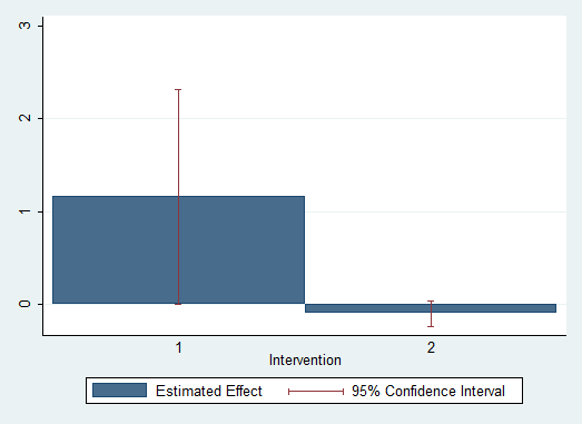
Answering those questions shows us why this is a “good” zero: many statistically insignificant effects are driven by imprecision. They’re positive and pretty big, but the confidence intervals are really wide. The graph above, which I just made with some simulated data, illustrates the difference. On the left, we have a statistically insignificant, badly-measured effect. It could be anywhere from zero to two and a half. The right is a precise zero: the CI doesn’t let us rule out zero (indeed, the effect probably is about zero), but it does let us rule out any effects worth thinking about.

*Bettinger was careful to state that the information intervention alone cold still be cost-effective since it’s so damned cheap.

More on airline ticket pricing, now with (a tiny bit of) actual data

Joe Golden shared this Atlantic piece on the evolution of airfares, and the way airfare is priced now. It reaches the same conclusion I have: airline tickets are a very strange market, characterized by many constraints, limited competition between sellers, and, most important, nothing close to the classic “law of one price”. If a gas station tried to charge you twice as much as the next guy in line, you’d probably throw punches, but that kind of pricing is pretty typical on airplanes.

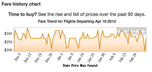
The article also has a nice graph that illustrates some of the random-looking price fluctuations that you see in airfares:

Screen Shot 2013-02-27 at 4.20.45 PM

The above chart is for a single route, departing on a single day. The time axis shows the date of a search for a fare on that route. Bearing in mind the human tendency to spot patterns in total noise, there appears to be a slowly-increasing regular fare of about $275, with a lot of large fluctuations from that level. Big downward spikes are definitely evident, and this might be masking their size (if what’s shown are daily averages, and the spikes are mixed with higher prices on a given day).

There are also upward spikes, consistent with anecdotes reported to me by a number of people. I’ve seen things like them myself. Michel, commenting on my last post, argues that these could be (false) signals sent by the airlines to indicate that flights are selling out. I agree that this is probably going on. The basic story is that you’re searching for a given flight, see a fare of $500, and decide to keep looking. Then you see a price of $1200. Crap! You start to freak out about the $700 you just lost. Maybe you open another browser or switch to incognito mode or delete your cookies. The next price you see is back down to $550 – thank god – and you buy it immediately to be safe. The airline has fooled you into taking their first offer, and even nudged you upward a bit. This is an interesting variation on price discrimination, one based on consumer psychology instead of income or demographics.

I differ with Michel’s conclusion that they are evidence for Valendr0s’s model (of exploiting cookies to track a given customer). An airline can try to scare potential customers by throwing in such upward spikes purely at random. It’s not clear that cookies give it any additional traction on this: if anything, a dedicated refresher like myself is signaling a lot of patience.

[Semi-technical aside: Michel also notes that my model has incomplete information on one side of the market. This is absolutely true, and in reality I think that incomplete information is the rule on both sides of the airline ticketing market. This drives all kinds of signaling by both sides. Sometimes I wonder about outright lies: when Kayak tells me there are only 2 seats left, are there any consequences if that’s not true?]

Random fluctuations around a fairly-high base price allow airlines to split the market into three segments, based on consumer preferences and psychology. The normal consumers will just take the base price or the low price as soon as they see it. Dedicated cheap types like myself will ride the refresh button until they get a low offer, while cautious cheap types will take the base price, or even a slightly higher one, if they see the high price offered first.  The story is getting richer and better-able to fit the facts, but we still need a data-scraping experiment (that randomly changes whether cookies are set) to test the different models on the table.

Dubious claims about the economics of airline ticket pricing

A friend recently sent me the following Actual Advice Mallard, containing a strategy for buying airline tickets that is the hot new thing on the interwebs:

gQ2sq3B

A link from Chris Blattman’s blog indicates that the source of this claim is most likely this reddit post by /u/Valendr0s, who claims experience working in airline ticket pricing and was rewarded with reddit gold (worth $4) for his comment. So this is widely seen as a useful fact, and taken at face value. And I don’t believe it for one second.

My skepticism is motivated by two factors: 1) theory, from my perspective as an economist-in-training, and 2) evidence, from the fact that my mother works for the world’s largest airline and the related fact that I am cheap as hell.

Theoretically, what are airlines trying to do when they vary their prices? Well, probably a lot of things, but most importantly they’re trying to price discriminate. This means separating their customers into categories by how much they’re willing to pay for tickets, and charging them different prices. A simple case of price discrimination happens at movie theaters, which give discounts to students and seniors, both of whom tend to have less income than middle-aged adults.

The classic example of price discrimination for airlines is to charge more for a roundtrip ticket that returns on a Friday than one that returns on the following Sunday or Monday. Why? Business travelers don’t want to spend their weekends away from home, and tourists do. Since business travelers don’t care as much about the cost of their ticket, this price structure can extract more profit out of the market by dividing it. If you charged the same price, then you could either charge a low price tourists will pay (and lose out of extra profit from business travelers) or a high price to gouge business travelers (and lose out on all the sales to tourists). Charging two different prices is the best of both worlds.

How else can airlines price discriminate? I’ve often suspected that the seemingly-random fluctuations in ticket prices over short periods of time are part of another price discrimination strategy. For simplicity, let’s say the market comprises 50 cheap people like me, and 50 normal folks who don’t want to waste their time shopping. Normal people will happily pay the typical market price of $100 for a ticket, but cheap people won’t, they’ll shop around or reconsider if the price is above $40. The two groups are otherwise identical, so there’s in principle no way to differentiate them. If the airline charges $100/ticket, only the normal people buy tickets and it makes $5000.* If it charges $40/ticket, everybody jumps on the tickets and it makes $4000. It seems like there’s no way to do better.

But maybe there is: the airline could randomly offer a $60 discount, 10% of the time. If it does this, then it makes 45*$100+5*$40=4700 from the normal people, who will take either price they see. The cheap people (e.g. me) will hit reload on kayak.com until they see the price they want. All 50 of them will eventually get the $40 ticket offer, so they pay a total of $2000 and the airline’s total profit is $4700+$2000 = $6700. This approach, which I’ll call “randomized price discrimination” just to give it a name, is much more profitable than either of the two alternatives.

Now, you might object that everyone should keep shopping until they hit the jackpot, but the assumption that some people won’t is potentially quite realistic. First off, consumers would have to realize this is how the system works. If cheap people go to different sites instead of refreshing just one, they might get the discount without knowing why it happened. Second, higher-income people have more reason to value their time, and empirically appear to do so more.

It’s also possible that airlines could do both: offer discounts at random but also try to identify “desperate” passengers. But pure reloads, tracked by cookies, are going to confound the two. We need some data. hutz hearsay
I don’t have any data, but what I do have are a couple of strong anecdotes. By virtue of my mother’s employment with Delta, I’ve done the vast majority of my lifetime travel on non-revenue passes. These were free when I was younger, and now are steeply discounted relative to full-fare tickets. The only catch is that when I use them, I fly standby. That’s usually an added benefit: I don’t have to plan ahead and can arrive pretty late to the airport. Every once in a while, though, all the flights are full, occasionally for days on end.

I therefore have a fair bit of experience with the kind of “urgency” that Valendr0s says airlines try to exploit: twice in the past year or so, I’ve ended up with no ticket, already late for something I needed to do, and had to give up on standing by for flight after flight and bite the bullet on a full-fare ticket.

In these situations, I’ve done exactly what the advice mallard discourages: continually hit refresh on travel search websites until I find something cheap. I generally look for roundtrip tickets, which are cheaper than one-way ones,** and move the return date around as I don’t plan to use the second leg.*** Consistent with my theory of randomized price discrimination, I was eventually able to find a ticket discounted by over 50% relative to the median, departing on the same day I bought the ticket. These prices I ended up paying would have been excellent even if I’d bought the tickets weeks in advance. My strategy focused almost solely on repeated searches in the Kayak app for my iPhone.

It might still be possible to rescue the Valendr0s model: maybe moving the return date around helps, or maybe there’s something special about the Kayak app. Maybe I “got lucky”, although that seems equivalent to the randomized price discrimination model being true. More important, I only really have two datapoints on this. If I were more ambitious, I might try to set up a data scraper to collect price offers under different conditions (incognito, cookies off, normal) for a range of different flights and days and see if we can sort out these different models.

Failing that, though, I’d actually recommend doing the opposite of what Valendr0s recommends. If you want cheap airline tickets: 1) don’t clear your cookies; 2) hit refresh, over and over; and most important, 3) signal thriftiness, and prove it by revealing the low value you put on your time.

Hat tip: BTK

*I’m ignoring any marginal cost per passenger here (that is, the increased fuel and soft drink costs associated with another person on the plane) but the result doesn’t depend on that.
**I still don’t have a good explanation for why this is the case. My only theory is that it’s a way of price discriminating between more- and less-informed travelers.
***Even if I wanted to use it, I could just pay the change fee later on.
Do churches deserve credit for reducing HIV transmission? Does anybody?

In an article on Slate, Jenny Trinitapoli and Alexander Weinreb argue that the decline in HIV incidence in Africa can be attributed to religious leaders preaching a pragmatic message of sexual morality and caution. As evidence, they cite different behaviors and beliefs among congregants at churches that discuss AIDS and sex compared with the rest of the population, based on their own research in Malawi.

This idea is consistent with some of my own personal experiences in Malawi, but the first question that comes to mind is what kind of person chooses to attend one of these particular churches, and why they do it. Church membership is anything but random, and it’s conceivable that self-selection is driving a lot of the differences they are picking up. Even if that’s not an important factor, there’s also the issue of the epidemiological importance of those affected by these religion-based messages: HIV epidemics are driven by high-activity subpopulations, who don’t strike me as particularly likely to show up at church. Instead, I’d assume they are more like the people Trinitapoli and Weinreb describe in this passage:

Many of us drink in the comfort of our own homes (often accompanied by our loving partners). But consumption of alcohol across Africa tends to be more public and to occur in places that provide opportunities for unsafe sex: Women working at bars and bottle shops often double as prostitutes.

Another question is what other factors should also receive credit for any decline in HIV incidence. Mother-to-child transmission prevention efforts now often involve putting HIV-positive mothers on permanent antiretroviral therapy, which we now know to have pretty huge benefits in terms of reducing HIV transmission.

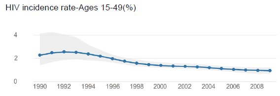
I’m also curious about their claims about changes in sexual behavior and HIV incidence – the authors cite incidence declines for Africa as a whole, but those don’t match what I understand to be the case for Malawi in particular. UNAIDS estimates show the incidence (new cases) to be fairly steady at 1% of the overall population.incidence

Maybe you can read a 25% (not percentage-point) decline since 2001 off that graph if you squint at it, but that would be something like 1.25% to 1%, a pretty small change in actual magnitude. If you do a back-of-the-envelope calculation, with a life expectancy of 10 years after infection, 1% incidence is consistent with a stable prevalence of 10% of the population. We can take this a step further: imagine following a cohort of 15-year-olds over time. Each year, 1% contracts HIV, so that the average across all people 15-49 is 1%. While increased mortality among HIV-positive people will keep the prevalence at any given time near 10%, by the time people reach 49 their total chance of HIV infection is 34%.* One in three. I’m not sure that it’s time to figure out whose needs to get credit for our huge success yet.

This isn’t to say that the idea isn’t really valuable – based on what they’re finding, I think somebody should try a pretty simple experiment where the treatment is training preachers on the sex and AIDS messaging that appears to be working.

*You might assume that by spreading the incidence over the 15-to-49 age range differently one could get a different answer, but I’m pretty confident that it doesn’t matter. If I had the inclination I could probably prove it mathematically.

Ceteris Definitely Non Paribus

Healthline has a press release about a paper by Orpinas et al. that studies the dating trajectories of adolescents (gated) and shows that people who date early (starting from middle school) have worse academic performance. The press release is titled “It’s Best to Wait”, and it does its best to pick and choose quotes from Professor Orpinas to make it look like she and her coauthors have found a causal relationship:

“When the couple splits, they have to continue to see each other in class and perhaps witness the ex-partner dating someone else. It is reasonable to think this scenario could be linked to depression and divert attention from studying.”

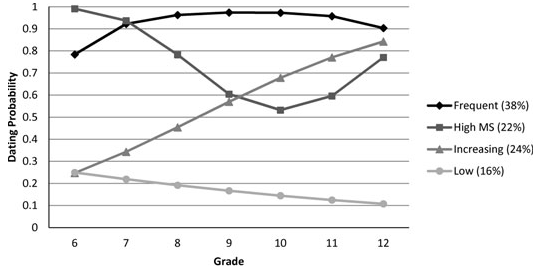
This is frustrating. The paper itself is really interesting, and not that hard to summarize: we can group adolescents into a set of just a few distinct dating trajectories, and people who follow different trajectories also differ in their academic performance, dropout rates, and drug use in the ways you might imagine they would. The graphs are really nice, too, to the point where I wish they’d made more. Here’s an example showing the different dating trajectories – note the “high middle school” group, which goes down and then back up.

dating trajectories

What I dislike about the Healthline report is that as far as I can tell, the authors make no causal claims of the kind the press release makes. They show an interesting association, and Orpinas is right that early dating could partly be a cause of poor academic performance or drug use. But to paraphrase something my advisor once said about a potentially causal relationship, “A lot of other stuff could be going on.” To pick one likely omitted variable, middle schoolers might start dating young because of a permissive home environment that also allows them to slack off in school.

“Early dating may be partly to blame for poor grades but they both emerge from a complicated system that shapes students’ lives so any causal effect is probably small” doesn’t sell well. I get it. You need a nice headline. But I’ve got a bit of a vested interest in this fight: I have several personal friends whose parents thought they needed to prevent them from dating in order to improve academic performance. I’ve always thought – and continue to think – that this attitude is bizarre, unjustified, probably harmful to social development, and poisonous to the parent-child relationship.

Hat tip: probably reddit.

Do any individuals respond to disease risks?

Ever since the early 1990s, a number of influential economists have argued that many epidemiological models need to be modified to account for endogenous changes in transmission. Traditional epidemiology assumes that individual choices can be ignored: models do not allow for individual agency, and the people being modeled just act like marbles bouncing of each other at random. More recently, the rules for these agency-free models have gotten more sophisticated in separating out different types of individuals, but the current paradigm in epidemiology (which I was exposed to during Jim Koopman’s excellent course on the topic in Fall 2011) still doesn’t have the people being modeled actually making any decisions.

Economic epidemiology has continued to develop as its own cross-disciplinary field, and has consistently focused on HIV as its most important case study. Starting with Philipson and Posner, economists have argued that models that account for risk compensation do a better job of forecasting the spread of HIV than those that ignore it. This pattern is stronger among gay men in the US than in sub-Saharan Africa, where responses tend to be small or even statistically indistinguishable from zero. However, recent work by my advisor and her coauthors (Godlonton, Munthali and Thornton 2012) and Dupas (2011) has shown that people in Africa do respond by changing their sexual behavior when they are taught facts about the relative risks of HIV transmission across population groups. At the same time, there’s increasing evidence (from Godlonton et al. and other work by Anglewicz and Kohler) that people in Malawi badly misunderstand HIV risks across all dimensions: they overestimate the prevalence of the virus, it’s transmission rate, and how quickly it kills you. I’m not aware of evidence that’s quite as systematic for developed countries, but preliminary research by Thornton, Foley and myself looking at US college students finds similar overestimates.

This is perplexing: it’s easy to see how the respondents in the Godlonton et al. and Dupas studies could respond to risks, because they were actively taught what those risks were. But how can we explain the famous* example of gay men in San Francisco reducing their sexual risk-taking in line with rising HIV prevalence if, as I suspect, they weren’t really aware of what the prevalence was? I suspect that many studies that compare individual-level behavior with factual information about disease risks are in fact picking up an intermediate variable, which is policy responses to the epidemic. The one group who is likely to understand the actual risks is the health authorities, who can enact provisions in response such as ad campaigns that aim to change social norms.

If this is what’s really going on, it would go a long way toward reconciling the finding of small risk responses in Africa (e.g. Oster 2012) with the larger ones seen in the US. Maybe individual responses are always small on average, and public health authorities are just much more active and responsive in the developed world (which would be consistent with their relative levels of funding).

This would also change the whole discussion of what economic epidemiologists have been measuring. If we are picking up responses by health officials, rather than individuals, then we can’t argue that our results are policy-invariant and hence a guide to optimal disease prevention.

NB I’ve been writing this on my iPhone as I weather a lengthy transit delay, thus the lack of supporting links. I hope to go back and throw some in later on.

*A textbook example of Kerwin’s Razor, which states that anything that needs to be titled as “famous” cannot in fact be famous. You wouldn’t say “the famous singer, Justin Timberlake”, because you don’t need to point out his fame. Everybody knows who JT is: he’s famous.

This might be the worst graph I've ever seen in my life

From the Economist’s article on the death of Hugo Chavez comes this little bit of ridiculousness:

“What the hell is this supposed to be showing?” you might ask. According to the article, “In real terms, between 2000 and 2012 Venezuela’s total oil revenues were more than two and a half times as great as those of the preceding 13 years—even though output declined after 2000 (see chart 1).” That is, the right end of the blue line immediately precedes the left end of the black line. And I guess the point is that the black line is higher? Those two lines both show oil revenues for the same country (Venezuela), but for different time periods, with the X axis giving the number of years since the beginning of a given period. Since Chavez took office at the beginning of 1999, they logically divided the graph at the beginning of 2000 instead. This graph manages to do a bad job of illustrating the basic thing it was going for – that oil revenues went up.

It gets better: to see the point made in the actual text, you would need to eyeball the areas underneath those two curves. Luckily, they don’t happen to cross, but I’m not sure I’d guess that the area under the black curve is 2.5 times the area under the blue one. It looks more like double to me. If only someone had invented a way to illustrate the relative proportions of two totals.

All I can think is that someone told the poor person responsible for making this graph that it needed to be (roughly) square. The Economist’s graphic design people, by revealed preference, clearly love square-shaped graphs.