Lots of papers present their key results as bar charts with 95% confidence intervals shown as whiskers. Here’s an example from one of my own slide decks:
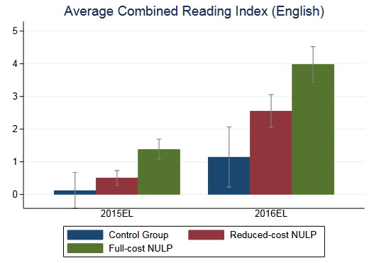
The problem with doing this is that we can’t actually tell whether the key differences are statistically significant. The reduced-cost group is about a third of a grade level ahead at the end of 2015. Is that statistically significant? It doesn’t look like it, because the CIs overlap.
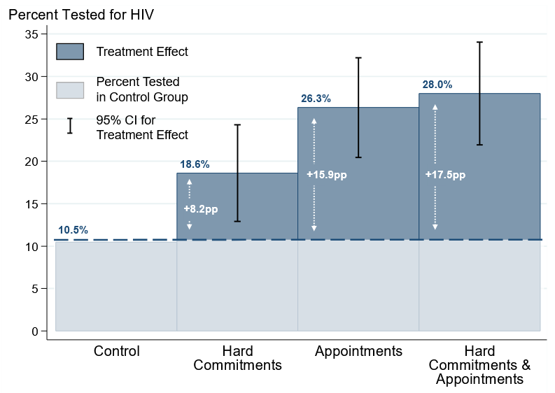
But just looking at CI overlap is misleading! Here’s an example where the CIs overlap but the p-value for the test of a difference in means is well below 0.05:

The key issue is that we don’t really care about estimating where the estimated mean will end up if we re-draw the sample, we care about whether the means are different from one another. One solution to this is a bit involved—you can show the CI for the treatment effect, like we do in this paper:
But there’s an even easier trick: if the samples are independently drawn, have the same sample size, and equal variances, you can just show the 83.4% CI instead.

Looking at whether these overlap genuinely will tell you whether the two means are significantly different. Here’s a ChatGPT 5.1 Thinking derivation of the math in case you’re interested. I also assert without proof that this will probably work pretty well even when the assumptions are slightly violated.
I learned about this clever trick from this blog post by Vanessa Cave.